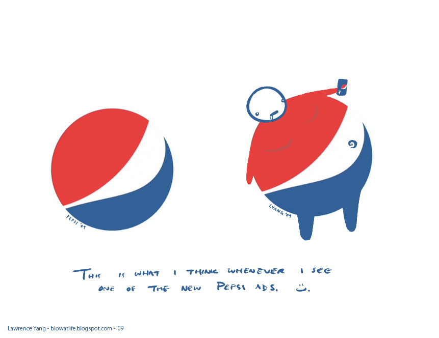
Pepsi Logo - A Response: digital
So they recently plastered the Powell BART station in San Francisco with Pepsi ads. Just big posters that say "POP", "HOPE", "SODA", "JOY", etc. All flaunting Pepsi's new lopsided logo.
And every time I see the logo, I can't help imagining a big belly button in the middle... So I thought I would share my vision with you all. You'll never look at the Pepsi logo the same again =).
----
Wow, hi internet. Thanks for stopping by -- If you'd like to see what else I do, the rest of my blog can be viewed here, or you can visit my artwork site here.
---
Back by popular demand... "Pepsi Logo - a response" tees!


Great job man! Hope you don't get sued.:)
Radu Burtescu
February 9, 2009 at 3:07 AMi LOVE this! thank you~
nicole
February 9, 2009 at 3:13 AMWhen i see it, I see a little bird. It actually reminds me of the bird from the old Always box. http://tinyurl.com/achomv
Anonymous
February 9, 2009 at 8:48 AMI got linked to your blog via the pepsi image. After looking through your posts I thought I'd leave a note saying how much I like your work. You are clearly very talented!
Drew
February 9, 2009 at 8:49 AMNice, I keep seeing your stuff using stumbleupon, you keep getting better, keep it up!
oo
February 9, 2009 at 8:52 AMHAHA! I'm so happy to see this.
Anonymous
February 9, 2009 at 9:15 AMFinally, an artistic response to how I feel about all of those horrid, sugary drinks that induce burping and bigger beltlines. Well done.
Anonymous
February 9, 2009 at 10:20 AMThanks for this. I see the same exact thing when I see that new logo.
Anonymous
February 9, 2009 at 10:26 AMClearly you put in far more thought than Pepsi's agency did.
Rob Frankel
February 9, 2009 at 11:29 AMI'd never even seen the new Pepsi logo before (I'm not a soda drinker), but I went to pepsi.com after seeing this, and I cannot stop laughing at the logo now. Hilarious.
Shanna
February 9, 2009 at 11:45 AMHahaha that's amazing. Real creative!
cynthia chung
February 9, 2009 at 11:49 AMgreat job, you're the best, hahahaha!!!
Javier Cerezo
February 9, 2009 at 11:56 AMGood job!
You're on Reddit: http://www.reddit.com/r/funny/comments/7w0i2/pepsi_logo_a_response/
Congrats!
Anonymous
February 9, 2009 at 12:54 PMBrilliant!
Anonymous
February 9, 2009 at 1:11 PMsoooo goood !!!
Lucas
February 9, 2009 at 1:22 PMBravo.
Cornhole Jones
February 9, 2009 at 1:35 PMBrilliant! You have just caused no telling how many painful meetings.
Anonymous
February 9, 2009 at 1:39 PMLove it. It's oh so true!
Feast of Fools
February 9, 2009 at 1:42 PMThe irony is delicious!
Anonymous
February 9, 2009 at 2:14 PMAs someone who's constantly trying to figure out the reason for design decisions, I have to say I think you've hit the nail on the head. Cuz otherwise I couldn't figure out why Pepsi felt the need to change their logo (and then plaster it all over the Powell station in San Francisco).
Super.
Anonymous
February 9, 2009 at 2:20 PMNow it reminds me of Strong Sad.
Anonymous
February 9, 2009 at 3:23 PMit reminds me of a guy bending over and if you draw a line you can see his butt crack. (the red is the shirt and the blue is the jeans.)
Anonymous
February 9, 2009 at 8:46 PMI like it, it seems if we drink it we will be like that.
one day one draw, I absolutely agree with you.
Peace man..
Rachmat Setyono Blog
February 9, 2009 at 9:14 PMOh I think we all know what they had in mind with this shitty redesign: Fauxbama.
Davezilla
February 9, 2009 at 10:57 PMGreat stuff!!
creative pix..
great site...
Anonymous
February 9, 2009 at 11:11 PMI would have liked to say that I posed for that... but my belly aint *that* big
Anonymous
February 9, 2009 at 11:24 PMlove it :)
Sonal Jhuj
February 10, 2009 at 2:16 AMhahahaha, Amazing! Your interpretation is way more captivating than the original super-sloppy logo
5teve
February 10, 2009 at 3:18 AMGreat interpretation of the logo. Great artwork! Awesome stuff.
truparad0x
February 10, 2009 at 6:14 AMTurn the Logotype upside doum and Pepsi looks like it spells 'is ded'
ArtForge
February 10, 2009 at 9:30 AMStrong Sad in a pepsi outfit.
Anonymous
February 10, 2009 at 9:48 AMhah. this is great. i love the subtle man-boobs.
Anonymous
February 10, 2009 at 10:18 AMhttp://www.hrwiki.org/images/2/23/pompom.PNG
Anonymous
February 10, 2009 at 10:22 AMExcellant! Beautiful interpretation...lol You rock :)
Anonymous
February 10, 2009 at 10:46 AMHow DARE Pepsi provide us with a soft drink that tastes good, but is unhealthy. Don't they know that many humans can't control themselves? It's Pepsi's fault, NOT ours!
Pepsi, you irresponsible bastards, your product should be banned and all we should have available to us is water, because WE CAN'T BE TRUSTED.
Oh, and Rob, your first name rhymes with Knob. Clearly I've put more thought into your name than your parents did. Right?
Anonymous
February 10, 2009 at 10:57 AMWow! That's great!
Queen Rosebud
February 10, 2009 at 11:38 AMBack in October, I saw butt cracks, and worked up a treatment on my site.
The New Pepsi Logo Looks Like A** (Literally!)
Not as artistically accomplished as yours, of course, but interesting anatomically-speaking.
Kevin M. Keating
February 10, 2009 at 11:59 AMAwesome!
Now when I see them in NYC, I'll have a quiet laugh to myself instead of rolling my eyes at the logo like I usually do...
Phil
February 10, 2009 at 12:27 PMViva La High Fructose Corn Syrup!
Anonymous
February 10, 2009 at 1:45 PMAwesome illustration! Not too far off from my critique here: Pepsico Rebranding
Anonymous
February 10, 2009 at 3:40 PMHaha, I do believe Joan Crawford just spun in her grave!
Great job!
(First saw this on ffffound, if you're keeping track.)
Anonymous
February 10, 2009 at 3:45 PMwow, publicity... good job.
This is quite clever. thanks for changing my view of pepsi.
rocketRefund
February 10, 2009 at 5:39 PMDid you see the big one that says "JOY" right by Chinatown?? It's huge!! And so ugly!
I love your illustration! This made my day! :D
AMO
February 10, 2009 at 6:15 PMhahaha... sweet! love it. :)
Anonymous
February 10, 2009 at 7:52 PMAmazing. Found this via Google reader "cool" recommendations. Took like 3 clicks to find my way back to the source.
This is gonna be all over the place.
OwlBoy
February 10, 2009 at 9:52 PMmmmm..type two diabetes. yum!
Poplab
February 10, 2009 at 11:17 PMHe looks sad..much like many soda drinkers.
Livgold
February 11, 2009 at 1:00 AMi noticed this at work when we started getting the new logo 2-liters; the diet pepsi logo has a slimmer middle bar, or midriff if you will. seeing this post reminded me of this, thought i'd share :)
http://upload.wikimedia.org/wikipedia/en/4/49/Diet_Pepsi_logo_2008.svg
http://upload.wikimedia.org/wikipedia/en/e/e9/Pepsi_logo_2008.svg
Unknown
February 11, 2009 at 4:33 AMPepsi is the only soda I drink. I'm really addicted to it. And I can't help to blame it for my discreet but always present pot belly.
Loved your inspiration!
Cheers.
Roger C. Rocha
February 11, 2009 at 7:18 AMBest thing I've seen all week.
Anonymous
February 11, 2009 at 7:20 AMyou made my day, thanks!
Chris
February 11, 2009 at 7:57 AMI've heard rumor that the re-imagining of the Pepsi logo was done to evoke the same feelings of Obama's logo used during the campaign. They even use words like CHANGE and HOPE and other buzz worthy words to evoke the same response.
Marbles
February 11, 2009 at 8:04 AMAs not only a graphic artist but an expressive artist, the new Pepsi logo has given me the same feeling I get when I hear nails on a chalkboard. Thanks for making this great picture ^^
Gabrielle N. Иormal
February 11, 2009 at 11:41 AMI like to talk about stool.
Anonymous
February 11, 2009 at 2:05 PMHey dude, As a fellow artist and designer I greatly appreciate this! it made me smile. Just wanted you to know put a shout out on my blog about it! keep up the good work!
http://jeffandgraydon.wordpress.com/2009/02/11/awesome-redesign/
Unknown
February 11, 2009 at 3:46 PMHa-ha!!! Love it!!!
Anonymous
February 11, 2009 at 4:01 PMit looked like an airline logo to me
Anonymous
February 11, 2009 at 5:39 PMhilarious, great work!
wool and misc
February 11, 2009 at 10:53 PMwe think this is brilliant
Unknown
February 12, 2009 at 3:09 AMthat is perfect!
cathy
February 12, 2009 at 5:03 AMClever and ingenious !
Anonymous
February 12, 2009 at 7:36 AMI loved this so much I posted it at notcot.org today. :) Great job! I knew this logo bothered me but I didn't know why.
c*liz
February 12, 2009 at 8:22 AMI can only imagine the boardroom meetings your logo adaptation will generate. Oh to be a fly on the wall...
Very ingenious.
Gypsy at Heart
February 12, 2009 at 8:53 AMI wonder when Pepsi will do a double-take & revert back to the old logo!
Anonymous
February 12, 2009 at 9:03 AMDamn you! I can never look at Pepsi the same again! Good thing I drink Coke.
Anonymous
February 12, 2009 at 9:40 AMSo so so so so true! Brilliant!
Anonymous
February 12, 2009 at 11:23 AMI never see an obeise person looking at the Pepsi logo. *looking at a can right now*
Anonymous
February 12, 2009 at 1:09 PMThis is great stuff! Now we need one for Coke...
Anonymous
February 12, 2009 at 1:37 PMIt's the boomer from Left 4 Dead!!
Anonymous
February 12, 2009 at 3:10 PMYou people are moronic! Finally, a good packaging design move comes along, and everyone hates it. It's not just another three-dimensional piece of trash like AT&T.
Anonymous
February 12, 2009 at 3:35 PMSome very interesting comments.
I personally like the new shape and colours of the logo.
But i hadnt seen it until i saw your interpretation, which may be why.
Very good vision.
**By the way you've just hit notcot.org if you are keeping track.
Anonymous
February 12, 2009 at 3:35 PMAmasssing. best thing i've seen all day
Anonymous
February 12, 2009 at 6:29 PMYES!!! Thank you... I finally get the new logo! ;-)
Anonymous
February 12, 2009 at 7:02 PMI love the Pepsi dude. Actually, when I look at it now, I can't help but seeing the backside of someone trying to bend over and pick something up but can't because of his size. The red is the t-shirt, and the blue is his pants, but in the white is a butt crack instead!
Anyway, I checked out your site and really dig your work. Have you ever considered showing your work at Upper Playground? They'd probably sell your t-shirts too. it's right up their alley.
Also, is there somewhere I could come look at it to potentially buy some?
-Spencer
Spencer Douglas
February 12, 2009 at 7:45 PMp.s.-I posted this on my facebook page to get you some well-deserved publicity.
Spencer Douglas
February 12, 2009 at 7:47 PMthis is so clever! i love it!!!!!!
Anonymous
February 12, 2009 at 7:55 PMI also like the fact that Pepsi always reminds me of DysPEPSIa
MicEdwards
February 12, 2009 at 10:24 PMamazing concept and you're right in changing my view about the logo forever.
Bhooshan
February 13, 2009 at 7:37 AMhere's my response to it (crudely done on powerpoint!)
http://www.facebook.com/photo.php?pid=5865177&l=1fdfe&id=636910272
Anonymous
February 13, 2009 at 7:50 AMbtw, i used your pepsi can. is there like internets etiquette or something i should be following?
Anonymous
February 13, 2009 at 7:55 AMPretty awesome.
Anonymous
February 13, 2009 at 12:40 PMI agree with you. The new logo sucks. I love you're drawing. I think it could also look like a muffin top or butt crack.
I wrote up my criticism of it on my blog here:
http://www.nikdaum.com/news/2009/01/new-pepsi-logo-sucks.html
Anonymous
February 14, 2009 at 5:19 PMand here i was, thinking pepsi was sweet, but this... ;)
Anonymous
February 15, 2009 at 1:57 AMVery witty and apt!!! :-)
Maya
February 15, 2009 at 6:18 AMI am a month (today) without a Pepsi. My friend sent me this link. Thank you! (I'm linking it to my blog.)
M.S.
February 15, 2009 at 9:15 AMMy response:
http://lh3.ggpht.com/_91LYNEDZUMs/SHB37EvvVkE/AAAAAAAAAu4/BJ7TO9EuLm4/s144-c/UntitledAlbum.jpg
MathChique
February 15, 2009 at 4:28 PMMore about it here:
http://www.underconsideration.com/brandnew/archives/the_new_pepsi_challenge_guess.php
Anonymous
February 15, 2009 at 5:29 PMwhat they did was say "how can we make this logo even uglier?" and they came up with the new pepsi logo :P
Anonymous
February 16, 2009 at 4:34 PMLawrence, that is freakin awesome!!! Love your creativity/imagination. Rock on! BTW, I found out about this pic from reading a twitter at http://twitter.com/jaygoldman
Anonymous
February 17, 2009 at 7:00 AMdude, you got a lawsuit coming your way if this thing catches on.
Kashfia
February 18, 2009 at 7:16 PMYou have hijacked their brand. If they have sense of humor, they will stay quiet and out of the way. The truth is what you did will likely connect with a small segment of people and they will drink more Pepsi because of it. Or maybe some good will come of your work and less people will drink those junk food drinks. Kind of like the Truth Campaign for cigarettes.
Great work either way.
Anonymous
February 18, 2009 at 8:13 PMThanks Lawrence, this image is now the very first thing that will come to mind on seeing pepsi.
Anonymous
February 20, 2009 at 4:12 AMI will NEVER see this in the same light again. EVER.
Thanks :D
Literally, lol...
adamson
February 22, 2009 at 9:16 AMPersonally, when I saw your AWESOME interpretation, I saw Strong Bad from Home Star Runner:
http://rawfoodrightnow.blogspot.com/2009/02/pepsis-logo-looks-like-obesity.html
I tried to make "Mr. Pepsi" look like Strong Sad.
But I can't change the total awesome-ness of your original.
Does the guy have a name? Or is he "Mr. Pepsi"?
Anonymous
February 22, 2009 at 8:02 PMHaving never been a soda drinker, and not being a t.v. viewer, and living many of my adult years in Vermont (the state without billboards) - I have never had an interest in logos.
That being said, it is clear - at least to me - that Pepsi may have intended to create a sort of red/white/blue happy face looking up at the sun with jubilation due to our 'new country' with President Obama ... and a take off of his campaign logo (which I DID care to notice!).
However, I think your depiction of Pepsi - the company and its products - is much closer to the mark ... right smack in the belly button of their audience. So much more honest. Cheers!
GoRawMe
February 23, 2009 at 9:27 AMand all this time i thought they were ripping off the Obama logo....turned out to be some fat dude.
Anonymous
February 27, 2009 at 10:48 AMI always saw it as a smile
Anonymous
February 27, 2009 at 5:45 PMDude, after enough people protest the New Logo, Pepsi's just going to restore their original logo only now they'll call it "Logo Classic". And then they'll make MILLIONS.
Anonymous
February 28, 2009 at 3:54 AMI enjoyed this!
One thing, though. My brother works at a supermarket and he asked the Pepsi worker that was delivering soda why they changed the logo and he said that now it represents a smile (the white). The bigger the smile, the more caffeine it has. Diet has the least, regular in the middle, and Max has the most. I thought it was kind of cool. :D
Anonymous
March 2, 2009 at 6:43 PMone word: Negativland
Anonymous
March 2, 2009 at 9:34 PMI hope Pepsi sues you.
Anonymous
March 5, 2009 at 6:26 PMI hope Pepsi sues you, too, because they won't win and it would make your interpretation famous. Way to go!
Brian Belefant, DGA
March 20, 2009 at 10:04 AMlooks good
Anonymous
March 20, 2009 at 5:06 PMThere's no question Pepsi was trying to co-opt the Obama campaign logo, and hence, ride his coattails; I was so disgusted by these lame and fatuous ads, and happy to see them ridiculed here.
Unknown
April 1, 2009 at 9:41 PMIts not that easy to see what you saw in that logo. You have a great eye and talent. Those losers who created the logo that you simply destroyed (and for good), should really hire you for some serious bucks to "bulletproof" their design candidates.
Anonymous
April 8, 2009 at 3:30 AMgood post
WoW Gold Guide
April 12, 2009 at 2:40 PMthat's a nice idea.there are all of pepsi's logo in my blog.entrepreneurs
Anonymous
April 16, 2009 at 12:22 PMHi,
Just love your work!! I especially love the Pepsi ad. Art imitates life!
Sharon
Medical Transcription
www.meditec.com
http://www.myspace.com/workingfromhomemom
Unknown
April 19, 2009 at 1:51 PMI hope Pepsi sues you.polo shirts
Blogger.jinbo
April 20, 2009 at 12:25 AMTotally just made my day, and I could resist setting this as my new desktop.
Well done!
Anonymous
April 25, 2009 at 2:10 AMYour Pepsi logo jarred me out of a two-month blogging hiatus. Thanks.
Lisa @ Corporate Babysitter
April 26, 2009 at 2:21 PMwow, I really want a Pepsi right now. The logo has different variations that change with the different Pepsi products. Am I right?
Chiang Mai
April 28, 2009 at 7:34 PMOnce I played 4story, I did not know how to get strong, someone told me that you must have 4story Luna. He gave me some 4story Gold, he said that I could buy 4story Luna, but I did not have money, then I played it all my spare time. From then on, I got some 4story money, if I did not continue to play it, I can sell cheap 4story Luna to anyone who want.
Once I played flyff, I did not know how to get strong, someone told me that you must have flyff penya. He gave me some flyff money, he said that I could buy flyff penya, but I did not have money, then I played it all my spare time. From then on, I got some flyff gold, if I did not continue to play it, I can sell cheap penya to anyone who want.
Anonymous
April 29, 2009 at 2:27 AMhahahahaha
Ted Heath
May 2, 2009 at 11:57 AMThis is so god dang funny I hope you figure out a way to get rich off it. It's freaking perfect. Way to go. Could they sue you if you reversed it?
Mr Koppa
May 5, 2009 at 5:33 PMYou are totally RIGHT, man...
I love Pepsi, the actual drink...... but the logo is just too f_cked up.
Anonymous
May 22, 2009 at 7:13 PMHave you ever noticed that when you turn a Pepsi can on its side, it looks like "isded" (is dead)?
Bubba
June 12, 2009 at 12:44 PM@radu burtescu, pretty sure satire is covered under fair use clause. can't be sued...
kinda hoped this would ruin pepsi's needless logo change.
rocketRefund
July 5, 2009 at 6:28 PMIt's beautiful! I feel full...
Love your work. Have you seen my BluBoy character?
BluBoy Comics by Ryan Spencer
July 28, 2009 at 1:48 PMit looks like strongsad!sesi
Anonymous
August 4, 2009 at 1:46 PMDUH! The new Logo is made to look like "Obama's campaign logo" Pepsi was in the tank for Obama.
I'll be damned if I drink Pepsi for taking political sides for such a left wing radical! I'll stick with Coca-Cola, who chooses to stay out of politics!
Anonymous
August 6, 2009 at 7:25 PMYou're probably my favourite person ever for this.
A-Shark
August 17, 2009 at 8:14 PMFFA instant classic!
Osaurus
August 27, 2009 at 8:57 AMHaHa, this is Awesome!
Anonymous
August 31, 2009 at 11:10 AMThe fact that these t-shirts are available in sizes from XL to 5XL is additionally hilarious to me.
Unknown
September 24, 2009 at 2:38 PMIs that a cigarette or drool?
Anonymous
September 25, 2009 at 11:20 AMI had a visual issue with this logo a lot like yours. Only the side I was picturing doesn't have view of his belly button :)
TGDStudios
September 29, 2009 at 8:11 AMFunny, I will always think of this every time I see the new Pepsi logo!
David
November 8, 2009 at 5:03 PMGo look at postsecret.blogspot.com this week:
"A designer friend told me that the secret inspiration for the new Pepsi logo was the Simpson's Comic Book Guy."
http://2.bp.blogspot.com/_a7jkcMVp5Vg/Sv-eew3RUqI/AAAAAAAAKXE/sp9bLzZk6S8/s1600-h/pepsicomicguy.jpg
Anonymous
November 14, 2009 at 10:39 PMBrilliant! Surprised no one has drawn on those poster ads on the streets with your rendition.
Anonymous
November 17, 2009 at 3:08 PMGreat blog and nice post I am trying to maintain a list of cute blogs. Thanks for nice collection of posts. I’m going to browse through these. it’s nice I can come and read your blog.
ccna ccent
cisco
November 21, 2009 at 11:02 PMvery nice article .keep it up.
Fat burning furnace
December 27, 2009 at 12:27 PMSoda's are so horrible for you, it doesn't matter which brand it is. Hell Pepsi and Coke can dissolve a tooth immersed in them overnight.
I think you hit the nail right on the head because that's what I see when I see their logo.
Anonymous
December 28, 2009 at 12:17 PMLovely design. Nice color combination in this design. Loved it. You rocks. Keep blogging. Thanks.
Gayathri
January 12, 2010 at 8:17 PMMy neighbor works in the accounting dept. for Pepsi and his story for the logo was that when it was presented his department the original explanation for the logo given by the "designer" was that it was a series of "smiles". I believe the creator has since changed his story given that it was a stupid one. Now he has some over-bloated artistic theory behind it which makes even less sense than the whole smiling concept.
Anonymous
January 20, 2010 at 9:19 AMhey man, stumbled in from the east coast. love the work. your new and improved pepsi logo is great. i want a shirt
Anonymous
March 4, 2010 at 8:04 PMI like that article. cheap cell phones
Air Jordan Shoes
nike tn
Chaussures Sport
MBT shoes
The North Face Jackets
polo shirts
Tennis Racquet
cheap shoes
wholesale polo shirts
Wholesale Polo Shirts
Anonymous
March 10, 2010 at 11:10 PMI like that you think. Thank you for share very much.
KINGRPG
March 30, 2010 at 6:55 AMwow, nice blog!
trustme
April 26, 2010 at 11:50 PMNFL Jerseys
Nike chaussures
Nike TN Chaussures
Anonymous
April 27, 2010 at 12:09 AMhttp://cellphones.blog.sohu.com
http://dressweddingstores.wordpress.com
http://discount-cell-phones.sosblog.com
Unknown
April 27, 2010 at 1:49 AMNFL Jerseys
linli
April 29, 2010 at 3:39 AMI think it wearing more comfortable than the former shirt.If you are looking for where can buy comfortable and fashion.then we are your best choice.Victoria Secret Pink.we aslo see many kinds jerseys
nfl.
lucy
April 29, 2010 at 3:47 AMExcellent blog, I'm looking for information on how to improve my health because I have some problems with my hair, so I would like to help me with advice on the subject, thanks!
generic propecia
May 3, 2010 at 4:12 PMhi friend!
Anonymous
May 3, 2010 at 4:12 PMEd-hardy-clothing
ed hardy clothing us|
ed hardy clothing|
ed hardy clothes|
ed hardy ugg boots|
ed hardy wear|
ed hardy polo shirts|
ed hardy love kills slowly|
ed hardy love kills slowly boots|
ed hardy love kills slowly shoes|
ed hardy love kills slowly shirts|
ed hardy trousers|
ed hardy jackets|
ed hardy women’s t shirts|
ed hardy boots|
ed hardy womens shirts|
ed hardy outerwear|
christian audigier jackets |
ed hardy womens jeans|
ed hardy handbags|
ed hardy winter boots|
ed hardy t shirts|
christian audigier hoodies|
ed hardy mens jeans|
ed hardy mens shoes|
ed hardy womens hoodies|
Ed-hardy-us
cheap ed hardy|
cheap ed hardy clothing|
ed hardy clothes|
ed hardy wholesale|
ed hardy clothing|
ed hardy outerwear|
ed hardy t shirts|
ed hardy long sleeve|
ed hardy hoodies|
ed hardy men’s|
ed hardy women’s|
ed hardy shoes|
ed hardy kid|
ed hardy jeans|
ed hardy handbags|
ed hardy pants|
christian audiger t shirts|
christian audigier hoodies|
christian audigier shirts|
Ed-hardy-shirts
Anonymous
May 11, 2010 at 7:01 PMThank you for this post..
download knight online vtunnel software
indir
May 17, 2010 at 10:16 AMHey very nice blog!! Man .. Beautiful .. Amazing .. I will bookmark your blog and take the feeds also…
artistic
houston Kenna
May 19, 2010 at 3:14 AMnew style,new design,cheap price shoes
lyle and scott polo shirt
mens lyle and scott
cheap lyle and scott
lyle and scott jacket
lyle and scott wholesale
puma Future cat
femmes mbt chaussures
puma Drift cat
Nike Air Max 2009
Nike Air Max 360
Nike Air Max TN
Nike Air Max TN Dollar
Nike Shox NZ
Nike Shox R4
Nike Shox Torche
Nike Air Max TN
Nike Shox R4
MBT kisumu sandal
discount mbt chaussure
mbt chaussure wholesale
puma Kart cat
nike tn requins
MBT CHAUSSURE FEMME
MBT CHAUSSURE HOMME
MBT KISUMU sandal
Nike Shox R4
Nike Shox R4 Cartoon
Nike blazer high
Nike blazer low
Nike Tn Net
Nike Air Max 360
Anonymous
May 20, 2010 at 1:45 AMHey, I read a lot of blogs on a daily basis and for the most part
people lack substance but
I just wanted to make a quick comment to say GREAT blog!…..
I’ll be checking in on a regularly now….
Keep up the good work!
GHD IV Stylers
GHD MK4 Stylers
GHD MK5 Stylers
GHD Precious Gift Set
GHD Pretty In Pink
ghd iv mk4 styler
chi camo collection
Anonymous
May 31, 2010 at 7:59 PMFashion blind date|Fashion blind date | The great maternal love|404 Not Found|404 Not Found|404 Not Found|hpdell's Blog|no title|hpdell on Flixya|Miss World|Health care|Miss World|no title|Health care|HTTP Error 400|Health care|Health care|Health care|Health care|Health care|ブログが存在しません - はまぞう|509 Bandwidth Limit Exceeded|Pianetablog.com | ...un mondo di blog!|eDnevnik, slovenski blog|Latest movies|Latest movies - BlogTh.com|Latest movies - @ myblog.de|Latest Hollywood movies|ブログが存在しません - ミエワン|Blog Host| Palungjit Blog|Blog Host|no title|meinBlog.at| - |MuseCrafters Portal|World Supermodel|Latest Games|hpdell blog|Latest Games|hpdell blog|meinBlog.at| - |no title|Chanel Series|Welcome to www.student.ac|French beauty brand new interpretation of the image of Chanel Coco Cocoon | battery.blogspace.fr | - |no title|Latest Games - BlogHoster|Blogonize - Finally, an easy to use innovative blog host!|Latest Games - BlogHoster|
keyboard
June 1, 2010 at 12:44 AMudtek's blog - Latest Games - Skyrock.com|Arcade game elements loaded Wang DTudtek's blog - Latest Games - Skyrock.com|Arcade game elements loaded Wang DT|Blog Host|Football|Latest movies|no title|Lose weight|eDnevnik, slovenski blog|Lose weight - JSK - Sur DzBlog.Net|Pianetablog.com | ...un mondo di blog!|Latest Games|Latest Games|Games Daquan — Just another Blogetey.com weblog|no title|Game Download|Game Download|no title|篩菫嬲冉∫? - BlogTh.com|game686's Blog|Wonderful game |Wonderful game|HTTP Error 400|game686 on Flixya|ブログが存在しません - ナムジャイブログ|game686 : What is new?|2010 Top Ten New Games|2010 Top Ten New Games| Latest Games|Welcome to www.student.ac|Blog Host|Quick Weight Loss Methods |Quick Weight Loss Methods - FreeBlogNetwork.com|Quick Weight Loss Methods|VefBlog: loss.vefblog.net|Lose weight|HTTP Error 400|Welcome to www.student.ac|ブログが存在しません - ナムジャイブログ|Lose weight|eDnevnik, slovenski blog|Lose weight|eDnevnik, slovenski blog|Page Not Found|HTTP Error 400|Street Beat Daren|Linkul Blog : みんなでつくる福井のブログポータルサイト|篩菫嬲冉∫? - BlogTh.com|Brak tytu?u|
keyboard
June 1, 2010 at 12:45 AMvery helpful article ...
just what I needed...
and by the way blowatlife Blog is great! keep it up I'll definitely come back!
buy foreclosed homes
Don Hancock
June 6, 2010 at 10:59 AMhttp://blowatlife.blogspot.com/2009/02/pepsi-logo-response.html
I just saw your art in this site. :O
Ecchin
June 10, 2010 at 4:18 AMMoncler
Moncler jackets
Moncler outlet
Sisley
Refrigiwear
spyder ski
spyder ski wear
Spyder Jacket
Burberry Sunglasses
ED Hardy sunglasses
GAFAS DE SOL OAKLEY
GAFAS DE SOL RAYBAN
Unknown
June 12, 2010 at 12:41 AMInteresting Article. Hoping that you will continue posting an article having a useful information. Thanks a lot! | sınırsız porno izle | porno izle | gizli çekim sikiş | porno izle | porno izle | bakire | adult hikaye | kerhane | sikiş sahneleri | am yalama | tecavüz | oyun oyna | süper oyunlar | göt sikme | kara şimşek | orgazm | jenna jameson | gabriella fox | bakire sikiş | annina ucatis | genelevde sikiş | sınırsız porno izle | sikişme sahneleri | ev pornosu | panda movie es | süper sikiş | sikişen karılar | lezbiyen am yalama | sikme | yarak yalama | rokettube | sikişme | evli türk pornosu | tecavüz | ama sokuş |
ahmet
June 15, 2010 at 3:39 PMI CAN'T UNSEE IT D:
Anonymous
August 13, 2010 at 11:55 AMThis is quite genius. :)
Elisa Franke
August 19, 2010 at 8:00 PMDid you know that the idea for the design of the new Pepsi logo came from comic book guy on the Simpson's
Renee Latendre
September 10, 2010 at 2:58 PMlogo is very good and can i know what is the meaning in it...
servant of light
September 12, 2010 at 3:00 AMi thought this was really funny! i'll never look at the pepsi logo the same way again :P
the fallen child
October 12, 2010 at 5:45 PMSoda's are so horrible for you, it doesn't matter which brand it is. Hell Pepsi and Coke can dissolve a tooth immersed in them overnight.
I think you hit the nail right on the head because that's what I see when I see their logo.
what if alice is in neverland
November 25, 2010 at 11:31 PMThis comparison is crazy funny-- I never saw the new Pepsi logo that way, but you can be sure I'm never going to see it any other way from now on!
the every darkness
December 24, 2010 at 10:32 AMThis rules. I actually remember one of the big guys at pepsi who helped design the logo said they were inspired by the comic book guy from the simpsons. Who has a red shirt, blue pants and his belly is always hangin' out. I guess great minds think alike. HAH
Meagan
June 14, 2011 at 4:00 PMLove this! I just put this on my blog Foodhealer.com, it's the lead story today. I hope that's OK, if not let me know and I'll remove it ASAP.
Celia K
July 8, 2011 at 6:23 AMThanks very much for your suggestion.I can get a lot of information from here...
geoffrey zakarian
April 13, 2012 at 2:47 AM