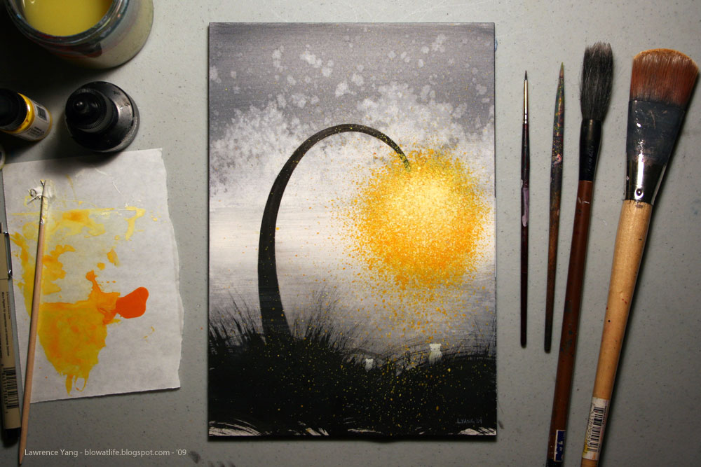
"Seussian Yellow" - ink, watercolor and gouache on paper - 7" x 10"
Hooray, third one is done! Here they are all together.
Hmmm. I may go back and redo the pink one though, it doesn't really sit quite right with me... Ah well, I'll worry about it tomorrow.
'night!


are you talking about how the pink one dips less than the other two? it doesn't look identical but it's nice that way, i think. maybe if you made more that dipped in different levels you could make a seussian rainbow. I think that'd be pretty. :)
Anonymous
November 28, 2009 at 6:22 AMThe pink one has too much contrast. I like the blue drawing the best because the dark area on the bottom helps create a very nice silhouette/ negative space. The yellow has a beautiful glow to it.
Anonymous
November 28, 2009 at 8:02 AMthese are lovely. they remind me of The Lorax, my favorite of his stories.
Anonymous
November 29, 2009 at 12:47 AMcheap nike shox shoes
nike shox r4
ed hardy love kills slowly shirts
ed hardy trousers
ed hardy jackets
puma mens shoes
cheap nike max
discount nike shox
ed hardy t shirts sale
ed hardy womens t shirts
ed hardy boots
cheap puma ferrari shoes
nike mens shoes
nike shox nz
ed hardy womens clothes
ed hardy womens shirts
ed hardy clothes
discount nike running shoes
discount nike shoes
nike shox shoes
ed hardy outerwear
ed hardy womens
ed hardy womens jeans
tennis rackets
babolat tennis rackets
Polo Shirts On Sale
Cheap Polo Shirts
nike femmes chaussures
nike chaussures basket
cheap nike shoes
nike sports shoes
puma running shoes
puma sneakers
ed hardy bags
ed hardy winter boots
ed hardy t shirts
nike shoes kids
nike women shoes
Anonymous
April 6, 2010 at 7:20 PM